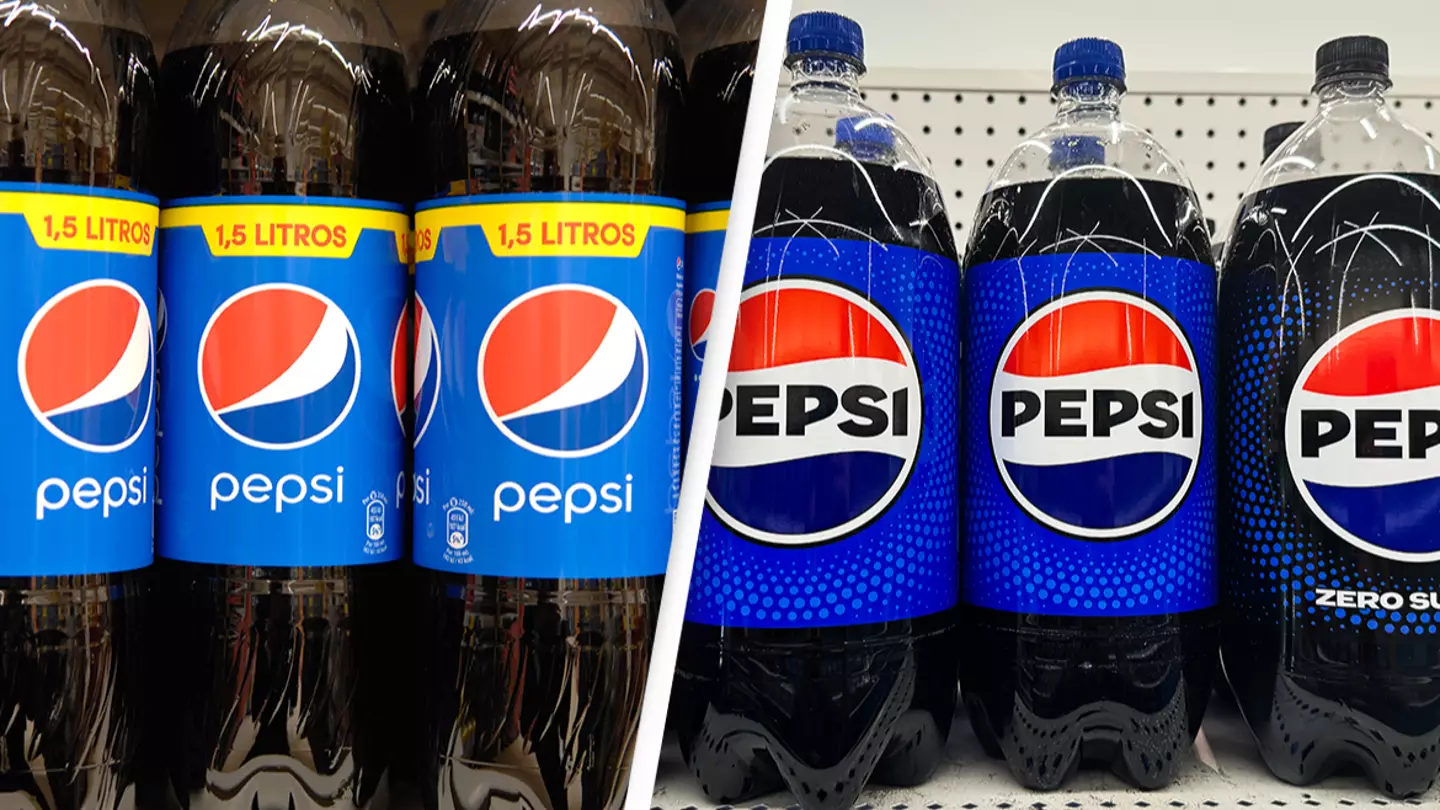
Pepsi has been a household brand for over a century, but many people don't know how the brand came to get its name.
Pepsi was first created way back in 1893 and initially went by a very different name.
Invented by pharmacist Caleb Bradham in the small town of New Bern in North Carolina, he first named it 'Brad's Drink'.
Crafted with a mix of sugar, water, caramel, lemon oil, kola nuts, nutmeg, and other additives, Bradham made the beverage to help with digestion.
Advert
But as the popularity for his drink grew, the pharmacist decided to rebrand and reportedly purchased the brand name of 'Pep Kola' from a local competitor and, changed then it to Pepsi-Cola.
But where did the Pepsi part come from?
Apparently, it comes from the word dyspepsia - AKA indigestion, which is what the drink was marketed on.
After renaming it, Braham stared selling Pepsi-Cola from his pharmacy in New Bern and, over 100 years later, it's now a global brand.
.jpg)
While its now hugely popular, not many people knew the origins of Pepsi's name and took to social media to voice their surprise.
Advert
"I was today years old when I learned that," someone penned.
"I had no idea," echoed another.
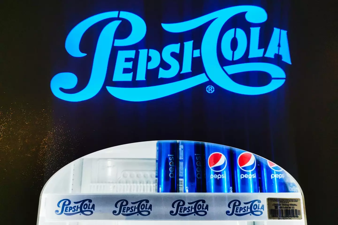
While Pepsi's name hasn't been changed for a long time, its logo has.
The brand announced that it was sprucing up its appearance earlier this year with a new logo.
Advert
Apparently a lot of people couldn't recall what the Pepsi logo looked liked when asked, sparking to company to make a change.
Speaking to CNN, PepsiCo’s first ever Chief Design Officer Mauro Porcini said: "We couldn’t ignore that kind of insight.
"Instead of rejecting it, we decided to embrace it."
The 'Pepsi' in the logo is 'decoupled from the globe' noted Pepsi’s Chief Marketing Officer Todd Kaplan.
Advert
"It’s this lowercase, italicised font, the blue is a little bit muted … it doesn’t exude that confidence and energy that the brand really represents," he said.
The last time its logo had a revamp was in 2009, and it cost Pepsi a pretty penny.
It's said to have cost the company $1 million due its array of so-called 'hidden features' behind the painstakingly detailed design.
Advert
Titled 'BREATHTAKING' the project, the rebrand was described as being a reflection of 'the Pepsi ethos [that] has evolved over time'.
It continued: "The vocabulary of truth and simplicity is a reoccurring phenomena in the brand’s history. It communicates the brand in a timeless manner and with an expression of clarity.
"Pepsi BREATHTAKING builds on this knowledge. True innovation always begins by investigating the historic path. Going back-to-the-roots moves the brand forward as it changes the trajectory of the future."
Alrighty then...
Topics: Food and Drink, Weird, Social Media