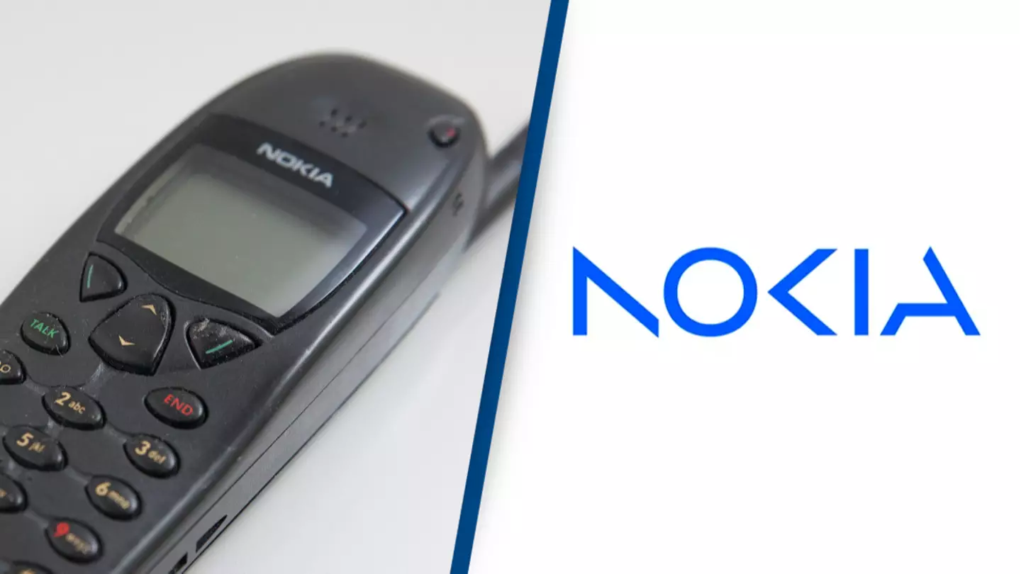
In the world of phones, Nokia's grip on the market once seemed as indestructible as their products.
By 2007, over half of all mobile phones sold around the world were from Nokia, and then along came smartphones and it all fell apart quite badly.
To their credit it takes some heavy machinery to actually destroy their old classics and if you're getting to that point it's pretty safe to say Nokia made some tough little phones back in their day.
Advert
Still, smartphones were able to destroy Nokia's market share and the business - which weirdly enough started out as a paper company - sold off their devices and services division to Microsoft in 2014.
They still make phones and are a big company, but the times have changed and they're no longer the people who put an indestructible device into everybody's pockets.
Deciding to reflect these changing times, Nokia have just unveiled their new company logo to the world and the world has responded by mercilessly trolling them over how it looks.
Advert
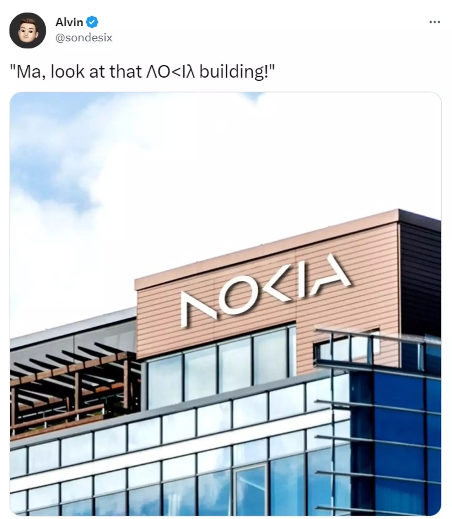
Nokia says they're 'refreshing our brand to reflect who we are today', and that means they've got an updated logo that looks pretty different to the image people associate with them.
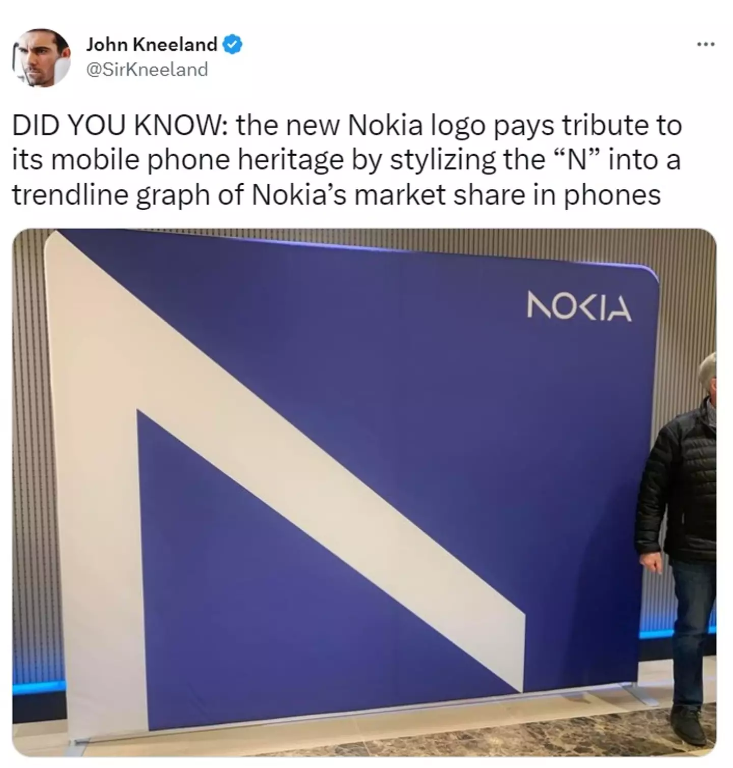
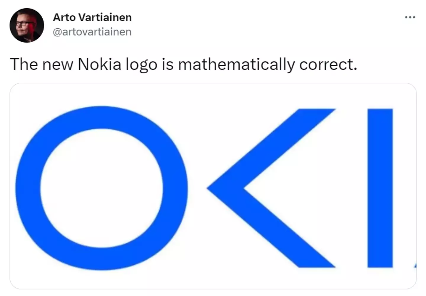
For starters the 'N', 'K' and the 'A' in Nokia are all now missing a line, which the company says pays tribute to 'the heritage of the previous logo' but is meant to feel 'more contemporary and digital' in line with their new image.
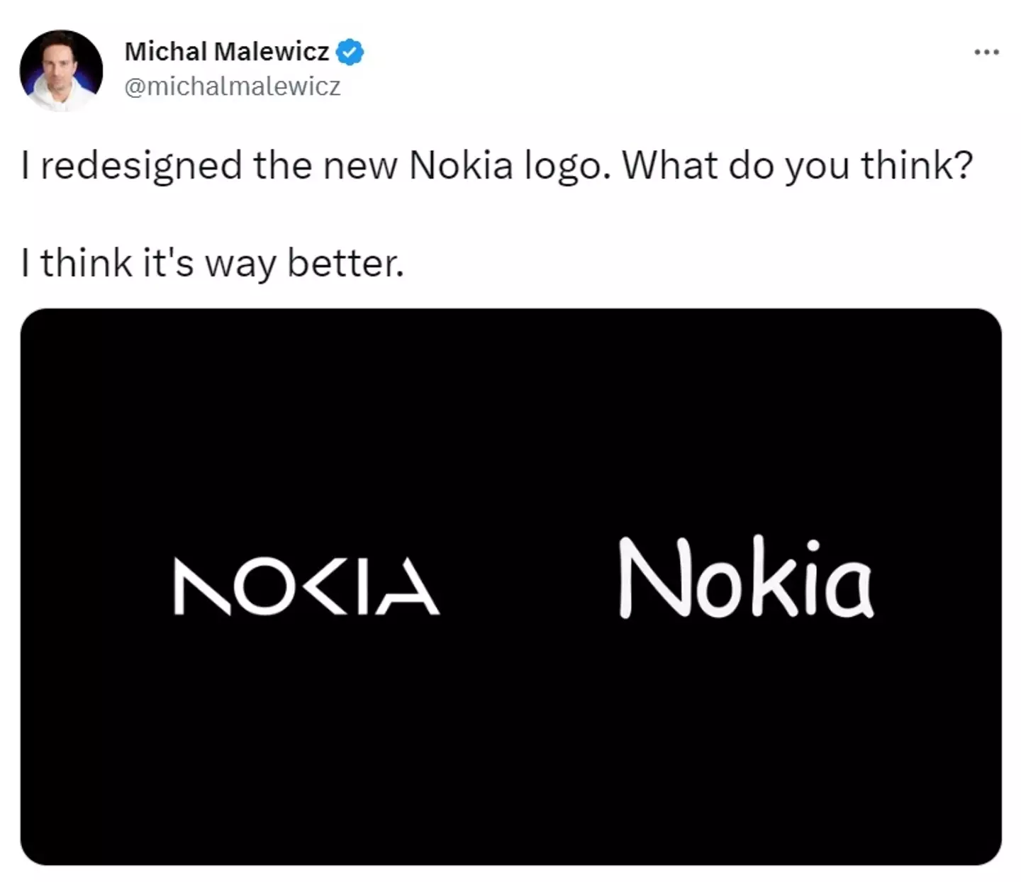
People trolling the new logo don't seem to like it all that much but have said that it's at least 'mathematically correct' as the middle bit reads O<I.
Advert
Others compared Nokia's new logo to car manufacturer Kia, who previously compressed their logo to remove the spaces between letters and ended up with something that was more 'KN' than Kia.
To get a bit existential here, when did it become so hip and modern to just hack chunks off of perfectly innocent letters willy-nilly?
Someone joked that Nokia's rebranding was actually just a budget cut in disguise and they were waiting until they had the money to 'pay for the rest of the sign'.
Advert
Even with all of this silliness Nokia and their old phones will still have a place in our hearts, and occasionally on our beaches too since one of them somehow washed up on one in Australia after surviving out at sea.
Their phones have been put through all sorts of trials and tribulations over the years, including the time a YouTuber decided to zap one with a million volts worth of electricity.
Amazingly the 3310 still worked after that, whereas a modern smartphone couldn't stand withstand the power.
Advert
To this day there still hasn't been a mobile game to rival Snake either.
UNILAD has contacted Nokia for comment.
Topics: Technology, Phones